Gujarat Board Statistics Class 11 GSEB Solutions Chapter 2 Presentation of Data Ex 2 Textbook Exercise Questions and Answers.
Gujarat Board Textbook Solutions Class 11 Statistics Chapter 2 Presentation of Data Ex 2
Section – A
Choose the correct option from those given below each question:
Question 1.
Which of the following variables is discrete?
(a) Height of a person
(b) Weight of a commodity
(c) Area of a ground
(d) Number of children per family
Answer:
(d) Number of children per family
Question 2.
Which of the following variables is continuous?
(a) Number of errors per page of a book
(b) Number of cars produced
(c) Number of accidents on road
(d) Monthly income of a person
Answer:
(d) Monthly income of a person
Question 3.
Name the method of classification of raw data related to daily demand of a product.
(a) Classification of attribute data
(b) Classification of numeric data
(c) Raw distribution
(d) Manifold classification
Answer:
(b) Classification of numeric data
Question 4.
Name the type of classification of the data related to the occupation and education of a person living in a certain region.
(a) Tabulation
(b) Classification of numeric data
(c) Raw distribution
(d) Discrete frequency distribution
Answer:
(a) Tabulation
![]()
Question 5.
In continuous frequency distribution, what is the class length of a class?
(a) Average of two successive lower boundary points.
(b) Average of class limits.
(c) Difference between upper boundary point and lower boundary point of that class.
(d) Average of upper boundary point and lower boundary point of the class.
Answer:
(c) Difference between upper boundary point and lower boundary point of that class.
Question 6.
Range of an ungrouped data is 55 and it is divided into 6 classes. Then, what is the class length?
(a) 10
(b) 9
(c) 9.17
(d) 10.17
Answer:
(a) 10
Question 7.
Inclusive classes for a distribution are 10- 19.5, 20-29.5, 30-39.5. What are the exclusive class limits for the second class?
(a) 19.5 – 29.5
(b) 19.75 – 29.75
(c) 20 – 30
(d) 19-29
Answer:
(b) 19.75 – 29.75
Question 8.
A discrete variable has values 0, 1, 2, 3, 4 with the respective frequency 2, 4, 6, 8, 14. What is the value of ‘more than’ type cumulative frequency when the value of variable is 2?
(a) 28
(b) 12
(c) 34
(d) 6
Answer:
(a) 28
Question 9.
A continuous distribution has classes 0-9, 10- 19, 20-29, 30-39 with the respective frequencies 10, 20, 40, 10. What is the less than type cumulative frequency for the boundary point 29.5?
(a) 30
(b) 50
(c) 70
(d) 80
Answer:
(d) 80
Question 10.
For a continuous variable, classes are 1 – 1.95; 2-2.95; 3-3.95; 4-4.95; 5-5.95, then what is the lower boundary point of the second class?
(a) 1.995
(b) 2
(c) 2.975
(d) 1.975
Answer:
(d) 1.975
Question 11.
Which of the following statements is /are true? Statement 1: A method of representing the
large and complex data in simple and attractive manner is called diagram.
Statement 2: Self-explanatory representation of main characteristics of the data is called diagram.
Statement 3: Representation of comparative study of data is called diagram,
(a) Only statement 1 is true.
(b) Only statements 1 and 2 are true.
(c) Statements 1, 2 and 3 are true.
(d) All three statements are false.
Answer:
(c) Statements 1, 2 and 3 are true.
Question 12.
The class intervals for a continuous variable are 0-99, 100-199, 200-299, 300-399, 400-499. What is the mid-value of the second s class?
(a) 149.5
(b) 150
(c) 199.5
(d) 99.5
Answer:
(a) 149.5
Question 13.
What do we call a table that shows designation, gender and marital status of employees of a company?
(a) Simple classification
(b) Classification of numeric data
(c) Manifold classification
(d) Simple table
Answer:
(c) Manifold classification
Question 14.
Which of the following diagrams is used to represent sub-data of classified information?
(a) Bar diagram
(b) Divided bar diagram
(c) Multiple bar diagram
(d) Pictogram
Answer:
(b) Divided bar diagram
![]()
Question 15.
Which of the following diagrams is used for comparing the sub-data of the classified data?
(a) Pictogram
(b) Pie chart
(c) Bar diagram
(d) Divided bar diagram
Answer:
(b) Pie chart
Section – B
Answer the following question in one sentence :
Question 1.
Define discrete variable.
Answer:
If a variable can assume definite or countable values within the specified range is called discrete variable.
Question 2.
Define continuous variable.
Answer:
If a variable can assume any value within the specified range is called continuous variable.
Question 3.
What is classification?
Answer:
A process of arranging ungrouped or raw data in systematic and short form is called classification.
Question 4.
State the types of classification.
Answer:
Classification is of two types:
- Quantitative classification and
- Qualitative classification.
Question 5.
Define the frequency of observation.
Answer:
A numeric value showing the repetition of value of observation is called frequency of that observation. It is denoted by symbol
![]()
Question 6.
State the method to determine number of classes on the basis of range of data and class length.
Answer:
When the rahge of data and class length are given, number of classes is determined by the following formula:
Number of classes = \(\frac{\text { range }}{\text { class length }}\)
Question 7.
When should one form a frequency distribution with unequal class lengths?
Answer:
When the range of raw or ungrouped data is very large, one should form a frequency distribution with unequal class length.
Question 8.
Define cumulative frequency.
Answer:
In a frequency distribution the sum of frequency upto the value of an observation or a class is called the cumulative frequency of that value of the observation or that class. It is denoted by symbol ‘cj\
Question 9.
Define ‘less than’ type cumulative frequency distribution for discrete data.
Answer:
A table showing ‘less than’ cumulative frequency corresponding to the various values of discrete data is called less than” type cumulative frequency distribution for discrete data.
Question 10.
Define ‘more than’ type cumulative frequency distribution for continuous data.
Answer:
A table showing ‘more than’ cumulative frequency corresponding to the lower boundary point of various classes is called ‘more than’ type cumulative frequency distribution for continuous data.
Question 11.
Write a formula for finding mid-value of a class.
Answer:
A formula for finding mid-value of a class is as follows :
Mid Value of a class = \(\frac{\text { upper limit of class + lower limit of class }}{2}\)
Question 12.
Define tabulation.
Answer:
Tabulation is a process of arranging the qualitative data In a systematic manner into rows and columns.
Question 13.
Define manifold classification,
Answer:
A classification of raw data on the basis of more than one attribute is called manifold classification.
Question 14.
What is the characteristic of the best table to represent qualitative data?
Answer:
The characteristic of the best table to represent qualitative data is ‘the table satisfies the objective of classification’.
Question 15.
What is the mam disadvantage of the classification of data?
Answers:
The main disadvantage of classification of data is that the basic form of the individual unit of the data is changed.
Question 16.
In statistical study, what is the main objective of a diagram?
Answer:
In statistical study, the main objective of a diagram is to represent the huge and complex data into simple, attractive and concise form.
![]()
Question 17.
State the types of diagrams.
Answer:
The types of diagrams are three :
- One dimensional diagram,
- Two-dimensional diagram and
- Pictogram.
Question 18.
For which type of data, multiple bar diagram is drawn?
Answer:
When the data about different places; things or times are given on more than one mutually related characteristics, multiple bar diagram is drawn.
Question 19.
When do we draw divided bar diagram?
Answer:
When the data about different places, things or times consist of several mutually related sub-data on different components are given, divided bar diagram is drawn.
Question 20.
State the main, objective of the percentage divided bar diagram.
Answer:
The main objective of percentage divided bar diagram is to compare effectively the mutually related sub-data.
Section – C
Answer the following questions as required:
Question 1.
Define quantitative and qualitative data.
Answer:
- Quantitative data: The data collected on numeric variable – discrete or continuous – are called quantitative data.
- Qualitative data: The data collected on the basis of qualitative variable or attribute are called qualitative data.
Question 2.
Define discrete frequency distribution with illustration.
Answer:
A table showing the frequency corresponding to various values of discrete variable is called discrete frequency distribution.
Discrete frequency distribution showing the number of children in 100 families

Question 3.
Define continuous frequency distribution with illustration.
Answer:
A table showing the frequency corresponding to various classes of continuous variable is called continuous frequency distribution. It is prepared, when the range of data is very large.
Continuous frequency distribution showing the height of 50 students of Std. XI

Question 4.
Explain the definition of inclusive continuous frequency distribution.
Answer:
If the upper limit of a class and lower limit of succeeding class are not equal and the upper limit of a class is included in that class, then such classes are called inclusive type of classes. A continuous frequency distribution consists of inclusive type classes is called inclusive continuous frequency distribution.
Explanation: The frequency distribution consists of classes 10- 19, 20-29, 30-39… is inclusive continuous frequency distribution. Here, the upper limit 29 of class 20 – 29 and the lower limit 30 of its succeeding class 30 – 39 are not equal. Also upper limit 29 is included in the class 20 – 29.
![]()
Question 6.
Write formulae for obtaining class boundary points from inclusive class limits.
Answer:
The formulae to find the class boundary points for the class limits of inclusive continuous frequency distribution are as follows :

Question 7.
Find the mid values of each class of the following frequency distribution:

Answer:
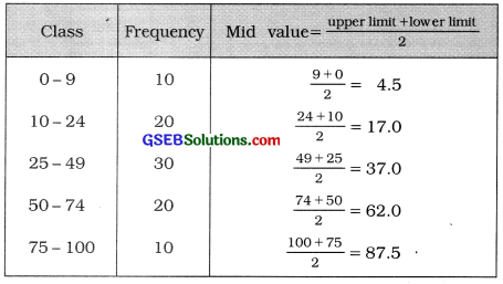
Question 8.
For the frequency distribution given in the above problem, find the class length of each class.
Answer:
The given frequency distribution is inclusive continuous frequency distribution. Converting it into exclusive form, we determine class length for each class.
The difference between upper limit of a class and the lower limit of immediate following class
is 1. Therefore we subtract \(\frac{1}{2}\) = 0.5 from the lower limit of a class and add it to the upper limit of the class.
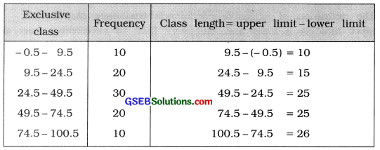
Question 9.
Prepare ‘less than’ type cumulative frequency distribution from the following:
| Observation | 10 | 20 | 30 | 40 | 50 |
| Frequency | 10 | 30 | 30 | 20 | 10 |
Answer:
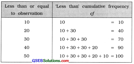
Question 10.
Demand of a certain item is classified as good, moderate and weak. On the basis of a study for entire year, it is known that the demand was moderate during 22 weeks, whereas the demand was weak during 18 weeks. Present this information in a table.
Answer:
We take 52 weeks a year.

[Note: The figure shown in bold, are obtained by simple calculations.]
![]()
Question 11.
Complete the following table:

Answer:

[Note: The figures shown in bold are obtained by simple calculation.
Question 12.
Differentiate between inclusive and exclusive continuous frequency distribution.
Answer:
| Inclusive Continuous Frequency Distribution | Exclusive Continuous Frequency Distribution |
| 1. It is carried out for the discrete raw data having | 1. It is carried out for the continuous raw data, large value of range. |
| 2. The upper limit of each class and the lower limit of its succeeding class are not equal. | 2. The upper limit of each class and the lower limit of its succeeding class are equal. |
| 3. The upper limit of a class is included in that class. For example, 20-24, 25-29, 30-34, …, etc. Here, upper limit 24 is included in the class 20-24. | 3. The upper limit of a class is excluded from that class. For example, 20-25, 25-30, 30-35, …, etc. Here, upper limit 25 is excluded from the class 20-25 and is included it its succeeding class 25-30. |
| 4. Class limits and class boundary points are not same. | 4. Class limits are the class boundary points. |
Question 13.
State the limitations of diagram.
Answer:
The limitations of diagrams are as follows :
- Lack of accuracy in drawing diagrams leads to wrong interpretation.
- Illusionary effect of diagrams misleads the public opinion.
- There is a loss of accuracy in presenting the data by diagrams.
Question 14.
What are one dimensional diagrams? State their names.
Answer:
A diagram drawn by considering only one characteristic of the clata is called one dimensional diagram. There are four types of one dimensional diagram:
- Bar diagram
- Multiple or adjacent bar diagram
- Simple divided bar diagram and
- Percentage divided bar diagram.
Question 15.
Explain two dimensional diagrams in brief.
Answer:
When the volume of data is large, then such data is presented on a diagram considering both length and breadth. Such diagrams are called two dimensional diagrams.
In two dimensional diagrams total value = Area of diagram
Square, rectangle, circle, pie or sectorial diagrams are two dimensional diagrams.
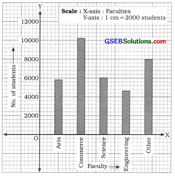
Question 16.
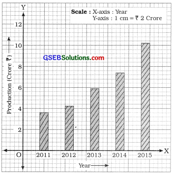
Represent the following data through a bar diagram:

Answer:
Simple bar diagram showing the production for different years

Answer:
Simple bar diagram showing the number of students In different faculties
Section – D
Answer the following questions as required :
Question 1.
What is the necessity of classification in statistical study?
Answer:
The necessity of classification in the statistical study is due to following reasons :
- To represent large data into simple, short and attractive manner.
- For easy comparison between the various characteristics of the data.
- To save, time, money and labour for the analysis of data.
- To obtain information easily regarding various characteristics of the data under study.
Question 2.
Explain the classification of numeric data with an appropriate illustration.
Answer:
The classification of numeric data is called numerical classification or quantitative classification.
Illustration: If the data are collected on ‘printing mistakes per page’ of a book of 50 pages, then 50 observations on ‘printing mistakes per page’ are obtained. Studying this ungrouped data it is observed that there are 10 pages having 0 printing mistake, 18 pages having 1 printing mistake, 10 pages having 2 printing mistakes and 12 pages having 2 printing mistakes. Thus, the process of dividing the data in this manner is called numerical classification, which can be presented in tabular form as follows :

Here, ‘Number of printing mistakes per page’ is numeric variable. Hence, classification mentioned above is called numerical classificaiton.
- The frequency table is formed by numerical classification of the data.
- Numeric variable may be discrete or continuous. Therefore, we get discrete frequency table or continuous frequency table by numerical classification of the data.
Question 3.
Explain the classification of qualitative data with a suitable illustration.
Answer:
The classification of the data on qualitative variable or an attribute is called qualitative classification.
Illustration: Selecting 50 flowers from a garden, the information on colours of flowers are obtained. It is observed from the data that 12 flowers are of white colour. 10 flowers are of yellow colour, 11 flowers are of red colour, 12 flowers are of pink colour and 15 flowers are of blue colour.
This data can be presented in short by a table as follows :
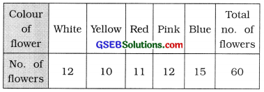
Here, ‘colour of flower’ is qualitative variable. Therefore, such classification is called the classification of qualitative data.
![]()
Question 4.
Write a short note on ‘cumulative frequency distribution’.
Answer:
Sum of the frequencies up to the value of an observation or class is called cumulative frequency (cf) and its distribution is called cumulative frequency distribution.
Two types of cumulative frequency distribution are :
1. ‘Less than’ type cumulative frequency distribution: The sum of the frequencies upto the specified value of the observation or specified upper boundary point of a class is called ‘less than’ type cumulative frequency of that specified value or class and the distribution is called ‘less than’ type cumulative frequency distribution. Here, cumulative frequencies are in ascending order.
2. ‘More than’ type cumulative frequency distribution: The sum of all the frequencies of the specified value of the observation or the lower boundary point of the specified class and the values or classes succeeding to it, is called ‘more than’ type cumulative frequency and its distribution is called ‘more than’ type cumulative frequency distribution. Here, cumulative frequencies are in descending order.
Question 5.
Discuss the points for constructing continuous frequency distribution.
Answer:
For constructing continuous frequency distribution the following points are to be considered :
- When the variable of the data is continuous or the range of variable is large, continuous frequency distribution should be constructed.
- Generally, the number of classes should be any number from 6 to 15. Under special circumstances, the number of classes may be less than 6 or more than 15.
- Considering the number of classes k and the range of data R. class length is decided using the following formula: c = \(\frac{R}{K}\)
- The value of c is selected such that ck ≥ R and c is positive integer.
- Generally, the class length of each class is kept equal. But under the circumstances that range of the data is large, keeping in view the number of classes, classes of different lengths can be constructed.
- Usually, the initial class should begin with the observation multiple of class length and a number smaller than and close to the lowest observation of the data.
- Classes can be chosen either inclusive type such as 10-14, 15-19, 20-24, … or exclusive type such as 10- 15, 15-20, 20-25
- For data on continuous variable exclusive type of classes should be preferred and when the range of discrete data is large one, then inclusive type of classes should be preferred.
Question 6.
State the guiding rules for the construction of a table.
Answer:
In order to make the information more meaningful and to derive significant decisions easily from the table, some guiding rules for the construction of a good table are as follows :
Guiding rules for Tabulation:
- Appropriate title should be given.
- There should be clear and simple captions to the rows and column.
- Size of the table should be proportionate to the space available.
- The interrelated information should be placed adjacent to each other.
- Large numbers should be represented in hundred, thousands, lakhs or crores.
- Separate lines should be drawn to distinguish the main characteristics of the data.
- Provision for indicating the totals of primary and subsidiary characteristics should be there in a table.
- Large volume of data should be represented in different tables instead of a single table.
- Source of the data must be mentioned at the end of the table.
- Before preparing the final table, a rough table should be prepared.
Question 7.
State the uses of tabulation.
Answer:
Tabulation is a process of systematic arrangement of qualitative or attribute raw data into rows and / or columns. Its uses are as follows :
Uses of Tabulation :
- Represents the extensive data in simple, organised and precise manner.
- Required information can be obtained easily.
- Various characteristics to be compared are placed side by side. Hence comparison becomes easy.
- Row and/or column totals are found, hence errors can be rectified easily.
- Unnecessary information is removed, hence the time, money and labour required for the study of data is saved.
- The analysis of the data becomes simple and convenient.
Question 8.
Obtain the original frequency distribution from the following data:

Answer:
The difference between two successive mid values is 100. Therefore class length c = 100 and using the formulae Lower limit = Mid value – \(\frac{c}{2}\) Upper limit = Mid value – \(\frac{c}{2}\) we obtain the class limits for each mid value. We get the original frequency distribution as follows :
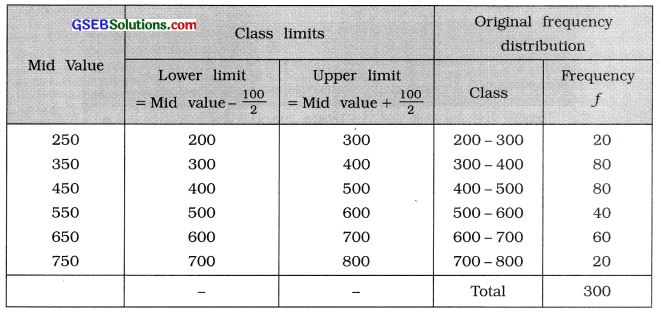
Question 9.
Out of 40 persons working in an office, 60 % are females and the remaining 40 % are males. 50 % of males are married, whereas the ratio of married and unmarried females is 5:3. Present this information in a table.
Answer:
Table showing the 40 employees of an office according to their sex and marital status
| Sex | Marital status | Total | |
| Married | Unmarried | ||
| Male | 8 | 8 | 16 |
| Female | 15 | 9 | 24 |
| Total | 23 | 17 | 40 |
[Explanation : No. of females = 40 × \(\frac{60}{100}\) = 24.
Therefore, No. of males = 40 – 24 = 16
No. of married males = 16 × \(\frac{50}{100}\)
Therefore, the number of unmarried males = 16 – 8 = 8
No. of married females = \(\frac{5}{8}\) × 24 = 15;
Therefore, the number of unmarried females = \(\frac{3}{8}\) × 24 = 9]
Question 10.
Information regarding the monthly income of 100 workers in given below. Obtain original frequency distribution from it.

Answer:
The difference between two successive upper boundary points is 500. Therefore, class length is c = 500. The original frequency distribution is obtained as follows :
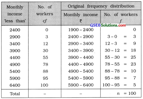
![]()
Question 11.
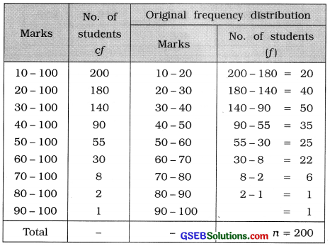
Marks of 200 students in an examination are as under. Obtain the original frequency distribution.

Answer:
Given frequency distribution is ’more than’ type cumulative frequency distribution. The difference between two successive lower boundary points is 10. Therefore, class length c = 10. The original frequency distribution is obtained as follows :
Question 12.
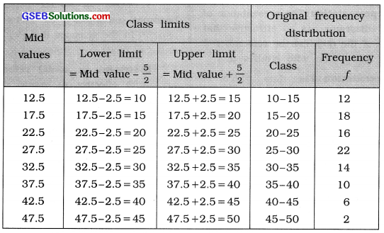
From the data given below, obtain original frequency distribution:

Answer:
The difference between two successive mid values is 5. Therefore class length c = 5. The original frequency distribution is obtained as follows :
Question 13.
There are 1000 buses used for the public transport in Ahmedabad city. Of them, 350 are used as BRTS and remaining as AMTS. Out of total 400 air conditioned buses, 250 were used as BRTS. Present this information in a suitable table.
Answer:
Table showing the number of persons in Ahmedabad city according to mode of transportation and type of bus
| Mode of transportation | Type of bus | Total | |
| AC | Non-AC | ||
| BRTS | 250 | 100 | 350 |
| AMTS | 150 | 500 | 650 |
| Total | 400 | 600 | 1000 |
Question 14.
Out of 1500 students of a college, 900 were boys and of them, 250 were in science stream, girls were in commerce stream. Present these data in an appropriate table.
Answer:
Table showing the number of college students according to their faculties and sex
| Faculties | Sex | Total | |
| Boys | Girls | ||
| Science Stream | 250 | 350 | 600 |
| Commerce Stream | 650 | 250 | 900 |
| Total | 900 | 600 | 1500 |
Question 15.
Explain the importance of diagrams in statistical study.
Answer:
The objective of diagram is to present data in simple and interesting manner. It provides an impressive medium to present the data in attractive manner.
Its importance in statistical study becomes more obvious by below mentioned usages.
1. Attractive presentation: The presentation of statistical data by diagrams are so attractive that the characteristics of the data can be remembered for long time by the person who studies it.
2. Clear presentation: The data which is difficult to understand by its elaboration can be explained easily by diagrams.
3. Simple presentation: The complex data can be easily explained by diagrams.
4. Easy to compare: Two or more data can be compared easily by diagrams.
5. Helpful to children and illeterates: The presentation of data by diagrams are very useful for illeterates, less educated and children. The message of data can be understood without considering the1 figures of data. Diagram is a unique device to educate the children.
6. Useful for business and industries: The traders and manufacturers can advertise their products effectively with the use of attractive diagrams.
7. Useful in social sciences: The diagram becomes mendatory to focus some important aspects in the sciences like Psychology, Economics and Sociology.
8. Helpful in social reforms: The diagrams are more effective to create desired impression on the minds of people by different campaigns, to educate different classes of society for removal of social vices and implanting social reforms.
9. Concise presentation: Large volume of statistical data can be presented promptly and in concise form by diagrams.
10. Uniform interpretation: The data represented by diagrams can be easily understood irrespective of language barrier.
Question 16.
Write a short note on one-dimensional diagrams.
Answer:
A diagram drawn by considering only one characteristic of the data is called one-dimensional diagram.
The types of one dimensional diagrams are four :
1. Bar diagram: It is used to represent the data on different places, things or times. To draw bar diagram, the different places, things or times are taken on X-axis and the measure of respective places, things or time on Y-axis with appropriate scale. Bars with equal width at equal distance are drawn with the height proportional to the measure. The diagram formed in such manner is called bar diagram.
In bar diagram the logical order of bars should be maintained. To make comparative study easy, the bars showing places or things should be arranged in proper order on the graph but the bars showing times are presented as it is on graph paper.
2. Multiple or adjacent bar diagram: When the data about different places, things or times are collected on more than one mutually related characteristics, then multiple bar diagram is drawn by placing the related bars close to each other. If the data given are related to time, then bars are drawn in order of, time but when the data are not related to time then they are arranged in ascending or descending order of any one of the characteristics of the data.
3. Simple divided bar diagram: If the data on different places, things or times consist of several mutually related sub-data on different components are given then simple divided bar diagram is drawn.
In this diagram first of all a bar of proper width and height proportional to the total value of the data is drawn. Then it is divided in accordance with the sub-data into different segments by various signs.
4. Percentage divided bar diagram: In simple divided bar diagram the mutually related sub-data cannot be effectively compared. To overcome this difficulty, percentage divided bar diagram is drawn.
In this diagram taking the total value of data as 100%, the percentages of sub-data are calculated. A bar of appropriate width and height proportional to 100% is drawn and is divided in accordance with the percentage of sub-data. By such diagram the mutually related sub-data can be effectively compared but the total value cannot be compared.
![]()
Question 17.
Write a short note on two dimensional diagrams.
Answer:
When the volume of the data is large then considering both length and breadth, a diagram drawn is called two dimensional diagram.
- In two dimensional diagrams the total value is shown as an area.
- Square, rectangle, circle, pie diagram are two dimensional diagrams.
Circle diagram: When the volume of the data regarding two or more places, things or times is large, then circle diagrams are drawn for such data.
- In circle diagram, square roots of the volume of different data are taken as the radius of circle. Arranging the radius in ascending or descending order, circles are drawns with centers on the same line at equal distance from each other. When the data on time are given then circles are drawn in order of time only.
- If the square root of the volume is too large, then divide by a constant and if it is too small then multiply by a constant. In this manner determine the radius.
Pie diagram: If the data on different places, things or times consist of several mutually related sub-data are numerically large, pie diagram is drawn.
- In this diagram, the total volume of the data is represented by a circle of suitable radius and this circle is divided into sectors in accordance with sub-data.
- Here, total volume of the data is taken as 360° and the volume of sub-data are expressed in terms of measures of angle and are presented on circle with respective circular sectors.
Question 18.
Explain pictogram with an illustration.
Answer:
A diagram in which the data are represented by selecting an appropriate picture is called pictogram.
- Illustration: If the data related to the yields of wheat are given, then it can be shown by symbols of ear of wheat. The pictures of ear of wheat or drawn in proportion to the amount of given data.
- Pictogram is such a diagram that it draws quick attention of the viewer.
- By pictograms the data can be easily understood by illiterates, less educated people and by children.
- Pictogram has no barrier of language, hence the data can be easily understood by people of any region.
Question 19.
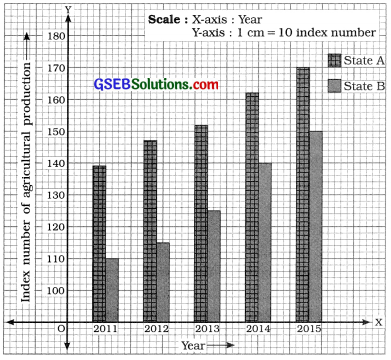
The agricultural production index numbers for two different states are as under. Present them using suitable diagram

Answer:
We draw multiple bar diagram by keeping the bars of Index number of agriculture production for States A and B adjoining to each other.
The years are shown on X-axis and the index numbers of agriculture production are shown on Y-axis.
Multiple bar diagram showing the index numbers of agriculture production of two states A and B for different years
Question 20.
Area (in sq. mt.) of 5 different regions is as under. Draw a pie diagram:

Answer:
Taking total area (5 ÷ 8 + 29 + 44 + 71 =) 157 = 3600. we prepare the following table for the calculation of degrees for the areas of different regions.
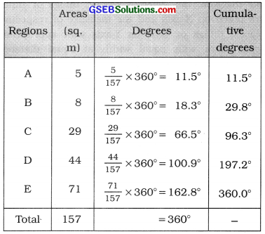
Pie diagram showing the areas of different regions
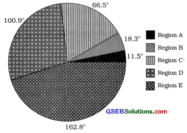
Question 21.
Production of a commodity in three different factories is as under. Present it through suitable diagram.
| Factory | P | 9 | R |
| Production (lakh ₹) | 256 | 576 | 1024 |
Answer:
Given data is numerically large. Therefore it is represented in circle diagram. To determine the radius for the production of different factories, we prepare the following table :
| Factory | Production (in lakh ₹) | Square root |
Radius = \( \frac{\text { square root }}{16} \) |
| P | 256 | 16 | 1 cm |
| 9 | 576 | 24 | 1.5 cm |
| R | 1024 | 32 | 2 cm |
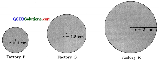
Section – E
Solve the following:
Question 1.
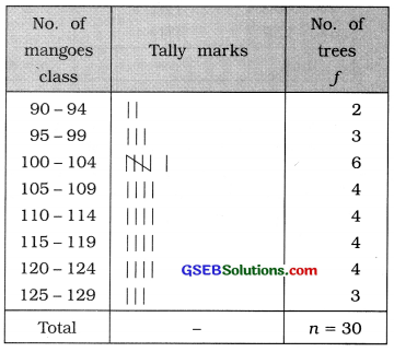
Number of mangoes received from different trees of mangoes in a farm during a season of 30 days is as under. Prepare a frequency distribution by taking class length 5.

Answer:
In the given data minimum number of mangoes = 92 and maximum number of mangoes = 128 and class length = 5. The number of mangoes is a discrete variable and its range is (128-92 =) 36. Therefore, we prepare inclusive continuous frequency distribution. The initial class that includes 92 mangoes will be 90 – 94 and the last class includes 128 mangoes will be 125- 129.
The frequency distribution is obtained as follows :
Inclusive continuous frequency distribution of mangoes received on mango trees during 30 days
![]()
Question 2.
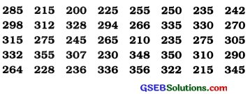
The data regarding the earnings (₹) of 40 rickshaw drivers during a certain day are as follows. Prepare a frequency distribution having one class as 220 – 239 and class length 20.
Answer:
In the given data minimum daily earning of rickshaw driver = ₹ 200 and maximum daily earning = ₹ 356.
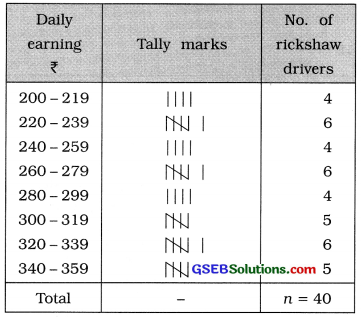
Class length = 20 and given class is 220 – 239. Therefore, the initial class that includes the minimum daily earning will be 220-219 and the last class the includes the maximum daily earning will be 340-359. The frequency distribution is obtained as follows :
Inclusive continuous frequency distribution of daily earning of 40 rickshaw drivers
Question 3.
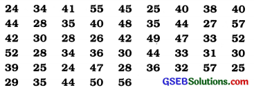
Information on monthly water consumption (in units) of 50 residents of a region is as under. By taking one of the classes as 25 – 30, prepare exclusive continuous frequency distribution.
Answer:
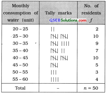
In the given data the minimum consumption of water of a residence during a month = 24 units and maximum consumption = 57 units. Given class is 25 – 30. Therefore, the initial class that includes the minimum consumption of 24 units is 20 – 25 and the last class the includes the maximum consumption of 57 units is 55 – 60.
The frequency distribution is obtained as follows :
Exclusive continuous frequency distribution of monthly consumption of water of 50 residents of a area of a city
Question 4.
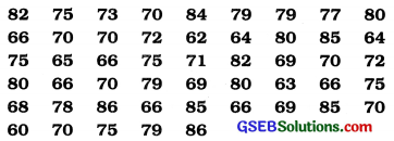
The data obtained by inquiring price of an item at 50 different shops are as under. Prepare a frequency distribution having the last class 85-90.
Answer:
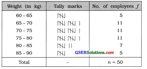
In the given data the minimum weight of an employee = 62 kg. The last class given of frequency distribution is 85 – 90. Therefore the initial class that includes the minimum weight 62 kg, we get 60-65. The frequency distribution is obtained as follows:
Exclusive continuous frequency distribution of weights (in kg) of 50 employees working in a company
Question 5.
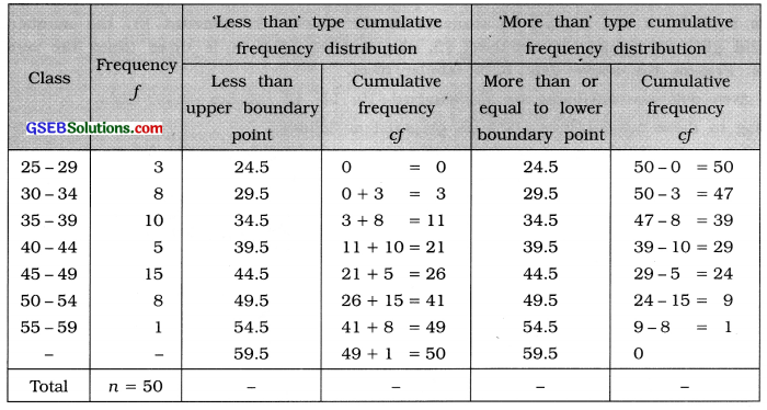
Obtain ‘less than’ type and ‘more than’ type cumulative frequency distribution from the following frequency distribution :

Answer:
Question 6.
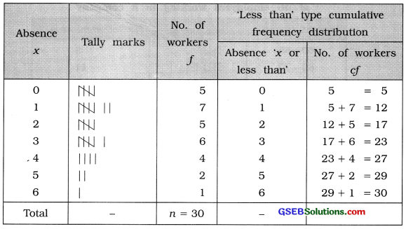
The following data refer to the daily absence of workers in a factory during 30 days. Prepare an appropriate frequency distribution and hence obtain ‘less than’ type cumulative frequency distribution.

Answer:
In the given data ‘Number of absences’ is a discrete variable. Therefore an appropriate frequency distribution is discrete frequency distribution. Minimum absence is 0 and maximum absence is 6. Therefore the frequency distribution is obtained as follows :
Discrete frequency distribution of absent workers of a factory during 30 days
![]()
Question 7.
There were 850 students studying in higher standards of a school. The number of students in standard 10, 11 and 12 were in the proportion 8:5:4. In standard 10, the number of boys is 30% of the number of students in the school. In standard 11, the numbers of boys and girls are equal. In standard 12, the number of boys is three times the number of girls. Present the above data in a tabular form.
Answer:
In the given data two attributes are :
- Standard : 10, 11, 12
- Sex: Boys, Girls
According to these two attributes table is prepared as follows :
Table showing the number of students of a school according to their standard and sex
| Standard | Sex | Total number of students | |
| Boys | Girls | ||
| 10 | 255 | 145 | 400 |
| 11 | 125 | 125 | 250 |
| 12 | 150 | 50 | 200 |
| Total | 530 | 320 | 850 |
[Explanation: No. of students in Std. 10 = \(\frac{8}{17}\) × 850 = 400
No. of boys in Std. 10 = 850 × \(\frac{30}{100}\) = 255
∴ No. of girls = (400 – 255 =) 145
No. of students in Std. 11 = \(\frac{15}{17}\) × 850 = 250
No. of boys = No. of girls = \(\frac{250}{2}\) = 125
No. of students in Std. 12 = \(\frac{4}{17}\) × 850 = 200
No. of boys = \(\frac{3}{4}\) × 200 = 150 and number of girls = \(\frac{1}{4}\) × 200 = 500]
Question 8.
In the year 2013, there were 1200 students studying in a school and of them, 400 were girls. 50 girls were not residing in hostel. In all 600 boys were residing in hostel. In the year 2014, there is an increase of 20% in the number of boys and the number of girls increased by 30 %. During this year, 260 boys and 100 girls were not residing in hostel. In the year 2015, 140 boys and 100 girls were newly admitted in the school and all of them resided with the hostel students. Present above data in a tabular form.
Answer:
In the given data three attributes are :
- Year: 2013, 2014, 2015
- Residence: Hostel, Not in hostel
- Sex: Boys, Girls
According to these three attributes, table is prepared as follows :
Table showing the number of students of a school according to their residence and sex during the years 2013 to 2015

[Explanation: 2013: No. of boys = 1200 – 400 = 800
No. of girls residing in hostel = 400 – 50 = 350
No. of students residing in hostel = 600 + 350 = 950
∴ No. of students not residing in hostel = 1200 – 950 = 250 20
2014: No. of boys = 800 × \(\frac{20}{100}\) + 800 = 960
No. of girls = 400 × \(\frac{30}{100}\) + 400 = 520
No. of students residing in hostel = 1480 – 360= 1120
2015: No. of boys = 960 + 140 = 1100
No. of girls = 520 + 100 = 620
No. of boys residing in hostel = 700 + 140 = 840
No. of girls residing in hostel = 420 + 100 = 520]
Question 9.
Present the following data in an appropriate tabular form. A bank receives 2000 applications as a response to the job advertisement. Of the total applicants, 50% were graduates, 40% were post graduates and remaining 10% have professional degree. Among the graduates, 60% were males and of them, 25% were married. 40% female graduates were married. Among the post graduates, 60% were males and 40% of them were married. Among post graduate females, 50% were married. 30% of the females had professional degree and of them, 60% were married. The number of married and unmarried males having professional degree was equal.
Answer:
In the given data three attributes are :
- Study: Graduate, Post-graduate, Professional
- Sex: Male, Female
- Marital status: Married, Unmarried
According to these three attribute, table Is prepared as follows:
Table showing the number of candidates for service in a bank according to their study, sex and marital status

[Explanation: Graduate : Total No. of candidates = 2000 × \(\frac{50}{100}\) = 1000
No. of graduate male candidates = 1000 × \(\frac{60}{100}\) = 600
No. of graduate married male candidates = 600 × \(\frac{25}{100}\) = 150
No. of graduate married female candidates = 400 × \(\frac{40}{100}\) = 160
Post-graduate: Total No. of candidates = 2000 × \(\frac{40}{100}\) = 800
No. of post-graduate male candidates = 800 × \(\frac{60}{100}\) = 480
No. of post-graduate married male candidates = 480 × \(\frac{40}{100}\) = 192
No. of post-graduate married female candidates = 320 × \(\frac{50}{100}\) = 160
Professional : Total No. of candidates = 2000 × \(\frac{10}{100}\) = 200
No. of professional female candidates = 200 × \(\frac{30}{100}\) = 60
No. of professional married female candidates = 60 × \(\frac{60}{100}\) = 36
No. of professional married and unmarried male candidates each = \(\frac{140}{2}\) = 701
![]()
Question 10.
The following table represents the number of workers of a factory according to their gender, residence and year:

Answer the following questions using the above table:
(1) What is the percentage increase in the total number of workers during the period of five years?
Answer:
Total No. of workers in the year 2010 = 2000
Total No. of workers in the year 2015 = 3000
∴ The increase in the total number of workers during 5 years period = (3000 – 2000 =) 1000 workers.
∴ Percentage increase in the total number of workers during 5 years period = \(\frac{1000}{2000}\) × 100 = 50 %
(2) Find the percentage decline in the number of non-local workers in the year 2015.
Answer:
No. of non-local workers in the year 2010 = 500
No. of non-local workers in the year 2015 = 400
∴ The percentage decrease in non-local workers in the year 2015 = \(\frac{(500-400)}{500}\) × 100
= \(\frac{100}{500}\) × 100 = 20%
(3) Find the percentage increase in the number of men and women during the period of 5 years.
Answer:
The percentage increase in number of male workers during five years = \(\frac{(2300-1500)}{1500}\) × 100
\(\frac{800}{1500}\) × 100 = 53.33 %
The percentage increase in number of female workers during five years = \(\frac{(700-500)}{500}\) × 100
\(\frac{200}{500}\) × 100 = 40 %
Question 11.
A mobile phone manufacturing company produces and sells two types of mobile phones. The particulars about it are given in the following table. Present it by a suitable diagram.
| Particulars | Mobile A | Mobile B |
| Raw material | 5000 | 6000 |
| Assembly expense | 3000 | 3000 |
| Other expense | 4000 | 4500 |
| Total expense | 12000 | 13500 |
| Selling price | 13000 | 15000 |
Answer:
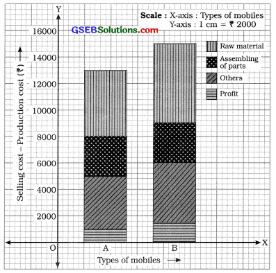
In the given data, details of production cost and sales of two types mobiles of a company are given. The expenditures of the different sections related to production are also given. Therefore considering the selling cost we draw simple divided bar diagram. For that we prepare the following table:
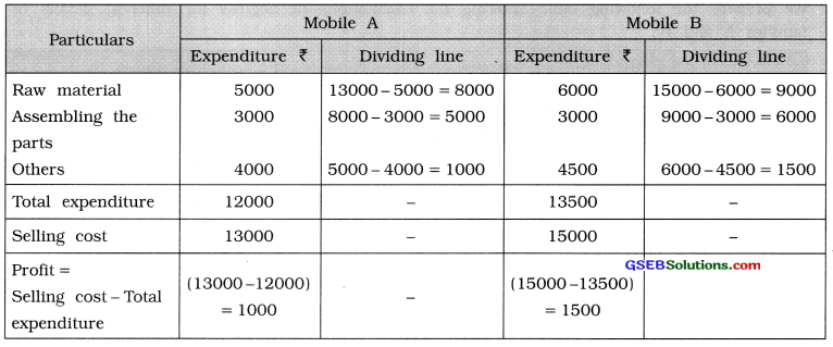
Drawing a bar proportional to sales, according production cost of different sections we divide the bar. The simple divided bar diagram is prepared as in figure 16.
Question 12.
Information regarding the average monthly expenses (In ₹) of two familles is as under. Present It through a pie diagram.
| Particulars | Family A | Family B |
| Food | 20000 | 16000 |
| Fuel | 5000 | 4000 |
| Transportation | 10000 | 8800 |
| House rent | 15000 | 18000 |
| Other | 22000 | 18000 |
Answer:
We prepare the following table showing the calculations of degrees for different details of two families A and B:
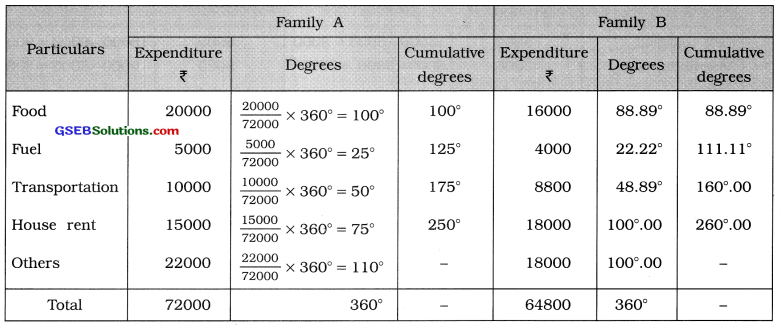
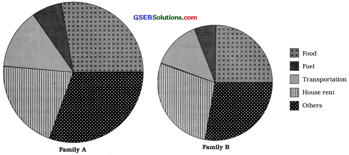
Taking an appropriate radius circles are drawn and are divided according to the degree of details. We prepare pie diagrams as follows :
Radius for family A = \(\frac{\sqrt{72000}}{100}=\frac{268.33}{100}\) = 2.68 = 3 cm
Radius for family B = \(\frac{\sqrt{64800}}{100}=\frac{254.56}{100}\) = 2.55 = 2.5 cm
Pie diagram showing the average monthly expenditure of two families
Section – F
Solve the following:
Question 1.
A sample of 25 lenses is selected from a day’s production of a company manufacturing eye lenses. The thicknesses (in millimeter) of these selected lenses are as under. Distribute these data into five classes of equal length.
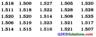
If the company decides that the lenses having thicknesses less than 1.510 and more than 1.525 are considered as defective then what per cent of lenses in the sample are defective?
Answer:
In the given data, minimum thickness of lens = 1.505 mm and maximum thickness of lens = 1.528 mm.
∴Range = 1.528 – 1.505 = 0.023
In 5 classes the data is to be distributed.
∴ Class length = \(\frac{0.023}{5}\) = 0.0046 ≈ 0.005
Therefore the initial class that includes minimum value 1.505 is 1.505 to 1.510 and the last class that includes maximum value 1.528 is 1.525 to 1.530. The frequency distribution is obtained as follows :
Exclusive continuous frequency distribution of thickness of eye lenses3
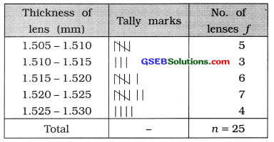
In the above frequency distribution the number of lenses of thickness less than 1.510 mm = 5 and the number of lenses of thickness equal to or more than 1.525 mm is 4.
Therefore total (5 + 4 = ) 9 lenses are defective.
∴ The percentage of defective lenses in the sample = \(\frac{9}{25}\) × 100 = 36%
![]()
Question 2.
The data related to variations in the price of a share for 30 days In a share market are as under. Prepare an exclusive continuous classification having class limits of one of the classes as 18.5 – 20.5.
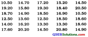
On the basis of this frequency distribution, answer the following questions:
(1) What is mid value of the 4th class?
(2) Find the number of days during which the price of share is at the most ₹ 16.50.
(3 ) Find the number of days during which the price of share is at least ₹ 19.50.
Answer:
In the given data, minimum closing price of share is ₹ 10.50 and maximum price is ₹ 20.80.
One class 18.5-20.5 is given. Therefore the initial class that includes the minimum value of ₹ 10.5 is 10.5-12.5 and the last class that includes the maximum value of ₹ 20.80 is 20.5 – 22.5.
The frequency distribution is obtained as follows :
Exclusive continuous frequency
(1) Mid value of fourth class :
Fourth class 16.5 – 18.5
∴ Mid value = \(\frac{18.5+16.5}{2}=\frac{35}{2}\)
= 17.5
(2) No. of days during which the closing price of share is at the most ₹ 16.50 mean the number of days during which the closing price of share is less than ₹ 16.50 = 2 + 6 + 8= 16 days.
(3) The number of days during which the closing price of share is at least ₹ 19.50 means the number of days during which the closing price of share is more than
₹ 19.50 = \(\frac{8}{5}\) + 2 = 4 + 2 = 6 days
(∵In 18.5-20.5, 8 days are uniformly distributed. Therefore in 18.5-19.5, 4 days are there.)
Question 3.
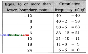
Owner of a factory has decided to produce 50 mixers used as household equipment, but the daily production of mixers changes due to variation in the number of workers. A variation in production of mixers with respect to a pre-decided number of production (100 units) during 40 days is recorded as under. Prepare an exclusive continuous frequency distribution having class length 6 and mid value of one of the classes as 3. Also prepare ‘less than’ and ‘more than’ cumulative frequency distributions.
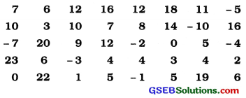
Answer:
In the given data, the minimum value of change in the production of mixers is -10 and maximum value is 23.
Class length = 6 and mid value of one class = 3 are given. Therefore lower limit of
that class = 3 – \(\frac{6}{2}\) = 3 – 3 = 0 and upper limit
of that class = 3 + \(\frac{6}{2}\) = 3 + 3 = 6
Thus, given class is 0-6. Therefore the initial class in the frequency distribution that includes the minimum value -10 is -12 to -6 and the last class that includes the maximum value 23 is 18 to 24.
The frequency distribution is obtained as follows :
Exclusive continuous frequency distribution showing the change in the production of mixers during 40 days
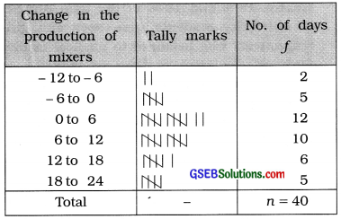
‘Less than’ type cumulative frequency distribution
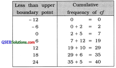
‘More than’ type cumulative frequency distribution
Question 4.
The data regarding the height (in cm) of 30 students of a school are as under. Prepare an inclusive continuous frequency distribution of 6 classes and hence prepare ‘less than’ and ‘more than’ cumulative frequency distributions:
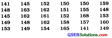
On the basis of it, answer the following questions :
(1) If participation in the NCC activities requires a minimum height of 160 cm then how many students are eligible to participate?
(2) Find the number of students having height from 153 cm to 163 cm.
(3) Find the maximum height of one-third of the students having minimum height.
Answer:
In the given data, minimum height of student is 141 cm and maximum height is 168 cm.
∴ Range = 168 – 141 = 27 cm
Data is to be classified in 6 classes.
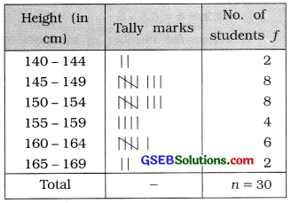
∴ Class length = \(\frac{27}{6}\) =4.5-5
Therefore, the initial class in inclusive type of frequency distribution that includes the minimum value 141 is 140-144 and the last class that includes the maximum value 168 is 165-169.
Inclusive continuous frequency distribution showing the height (in cm) of 30 students of a school
‘Less than’ type cumulative frequency distribution
| Height less than upper boundary point | Cumulative frequency cf |
| 139.5 | 0 = 0 |
| 144.5 | 0 + 2 = 2 |
| 149.5 | 2 + 8 =10 |
| 154.5 | 10 + 8 = 18 |
| 159.5 | 18 + 4 = 22 |
| 164.5 | 22 + 6 = 28 |
| 169.5 | 28 + 2 = 30 |
‘More than’ type cumulative frequency distribution
| Height equal to or more than | Cumulative frequency ‘ cf ’ |
| 139.5 | 30 = 30 |
| 144.5 | 30 – 2 = 28 |
| 149.5 | 28 – 8 = 20 |
| 154.5 | 20 – 8 = 12 |
| 159.5 | 12 – 4 = 8 |
| 164.5 | 8 – 6 = 2 |
| 169.5 | 2 – 2 = 0 |
1. To participate in NCC height 160 cm is required. Therefore the students with height 160 cm or more can join NCC. The number of such students is (6 + 2) = 8.
2. In 150-154, there are 8 students
∴ In 153 – 154, the number of students
= \(\frac{8}{5}\) × 2 = 3.2 ≈ 3
In 155- 159, there are 4 students
In 160-164, there are 6 students
.-.In 160-163, the number of students
= \(\frac{6}{5}\) × 4
= 1.2 × 4 = 4.8 ≈ 5
Therefore the number of students whose heights are between 153 cm to 163 cm. The number of students in 153 – 154 + the number of students in 155-159 +the number of students in 160-163 = 3 + 4 + 5=12 students
3. One-third students = \(\frac{30}{3}\) = 10
The height of 10 students having least height falls in the class. Therefore their maximum height =149 cm.
Thus, the maximum height of \(\frac{1}{3}\)rd students having least height is 149 cm.
![]()
Question 5.
The students of a university were classified according to faculty and gender. 60 % of total 40,000 students were boys. The number of girls in engineering faculty was three times the number of girls in commerce faculty. 15% and 10% of the total number of university students were boys and girls respectively who belonged to medical faculty. 20 % of the total number of students in the university belonged to faculty of science and among these students, the number of girls were one-seventh of the number of boys. 7% and 17% of the total number of students of arts faculty were boys and girls respectively. 3.75 % of the total number of students of the university belonged to the commerce faculty and the proportion of boys and girls among them was 3: 7.
Present the above data in an appropriate table.
Answer:
In the given data two attributes are :
- Faculty: Engineering, Medical, Science, Arts, Commerce
- Sex: Boys, Girls
According to these two attributes table is prepared as follows :
Table showing the number of students of a university according to their faculties and sex
| Faculty | Sex | Total no. of students | |
| Boys | Girls | ||
| Engineering | 7750 | 3150 | 10900 |
| Medical | 6000 | 4000 | 10000 |
| Science | 7000 | 1000 | 8000 |
| Arts | 2800 | 6800 | 9600 |
| Commerce | 450 | 1050 | 1500 |
| Total no. of
students |
24000 | 16000 | 40000 |
[Explanation:
No. of boys = 40000 × \(\frac{60}{100}\) = 24000
No. of girls = (40000 – 24000 =) 16000
No. of girls in medical faculty = 40000 × \(\frac{10}{100}\) = 4000
= 4000 and No. of boys = 40000 x \(\frac{15}{100}\) = 6000
∴ No. of students in medical faculty = (4000 + 6000) = 10000
No. of students in Science faculty
= 40000 × \(\frac{20}{100}\) = 8000
Suppose, the number of boys = x = 7000
∴ No. of girls = \(\frac{x}{7}\) = 1000
Now, x + \(\frac{x}{7}\) = 8000
x = 7000
∴ No. of boys in Arts faculty = 40000 × \(\frac{7}{100}\)
= 2800
and No. of girls = 40000 x -yyr = 6800
∴ The number of students in Arts faculty = 2800 + 6800 = 9600
No. of students in commerce faculty = 40000 × \(\frac{17}{100}\) = 1500
∴ The number of students In Arts faculty = 2800 + 6800 = 9600
No. of students in commerce faculty = 40000 × \(\frac{3.75}{100}\) = 1500
The proportion of boys and girls is 3:7.
∴ No. of boys = \(\frac{3}{10}\) × 1500 = 450
No. of girls = \(\frac{7}{10}\) × 1500 = 1050
No. of girls in Engineering faculty
= 3(1050)
= 3150
No. of boys
= 24000 – (6000 + 7000 + 2800 + 450)
= 24000- 16250 = 7750
∴ The number of students in Engineering faculty
= 7750 + 3150 = 10900]