Gujarat Board Statistics Class 11 GSEB Solutions Chapter 2 Presentation of Data Ex 2.3 Textbook Exercise Questions and Answers.
Gujarat Board Textbook Solutions Class 11 Statistics Chapter 2 Presentation of Data Ex 2.3
Question 1.
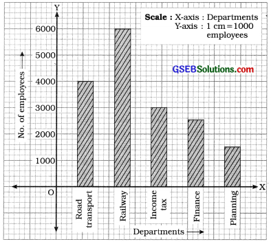
Following is the data on the number of employees working in various Government departments. Present it with a suitable diagram.

Answer:
Here, Departments are shown on X-axis and taking scale 1 cm = 1000 employees and drawing bars for different departments, simple bar diagram is prepared as in figure:
In the given data, only one variable characteristic is the number of employees in different Department. Therefore, simple bar diagram is an appropriate diagram.
Question 2.
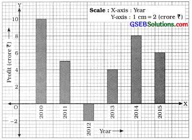
The data on the profit of a company is as under. Present it by an appropriate diagram.

Answer:
In the given data, one variable characteristic is yearly profit. Therefore, simple bar diagram is an appropriate diagram.
Here, Year is shown on X-axis and Profit is shown on Y-axis taking scale 1 cm = 2 crore profit and drawing bars for different years, the simple bar diagram is prepared as in figure:
![]()
Question 3.
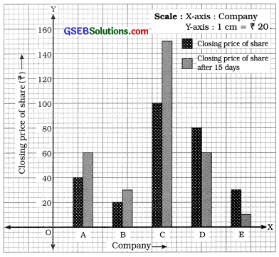
Changes in the price of share of 5 companies at Mumbai Stock Exchange during an interval of 15 days are as follows. Present them by a suitable diagram.

In the given data, two variable characteristics are closing price of share and closing price of share after 15 days. Therefore, multiple bar diagram is an appropriate diagram.
Here, companies are shown on X-axis. Closing price of share and closing price of share after 15 days are shown on Y-axis taking scale 1 cm = ? 20 and drawing multiple bars for two different variable characteristics for each company, multiple bar diagram is prepared as in figure.
Multiple bar diagram showing the closing price of shares of different five companies of Mumbai Stock Exchange
Question 4.
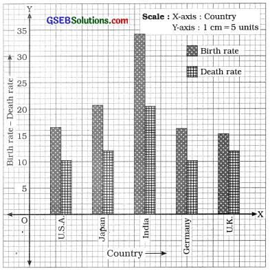
Information regarding the birth rate and death rate of 5 countries is as under. Present it by a suitable diagram.
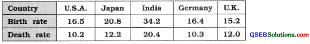
Answer:
In the given data, there are two variable characteristics: Birth rate and death rate of different countries. Therefore, multiple bar diagram is an appropriate diagram.
Here, different countries are shown on X-axis. Birth rate and death rate are shown on Y-axis taking scale 1 cm = 5 units. Drawing the multiple bars for birth rate and death rate, the multiple bar, diagram is prepared as in figure 4 :
Multiple bar diagram showing the birth rate and death rate of different five countries during a year
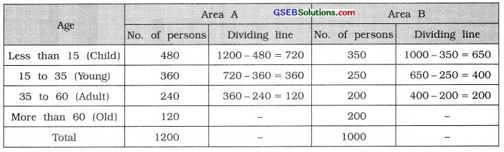
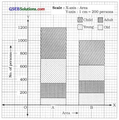
Question 5.
Information regarding the age of persons living in two different regions is as under. Present it by using an appropriate diagram.
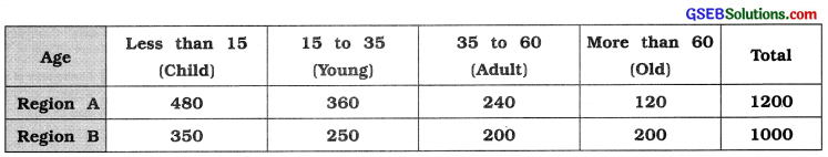
Answer:
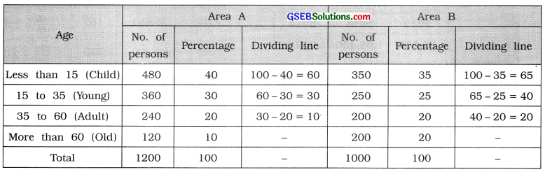
The data on different age group is to be represented. Therefore, divided bar diagram is drawn. We prepare the following table showing the dividing line for different section of age in each bar:
In figure, Area A and Area B are shown on X-axis. Bars are drawn taking appropriate width and length proportional to number of persons, taking scale 1 cm = 200 persons on Y-axis.
Divided bar diagram showing the age of persons reading in different two areas
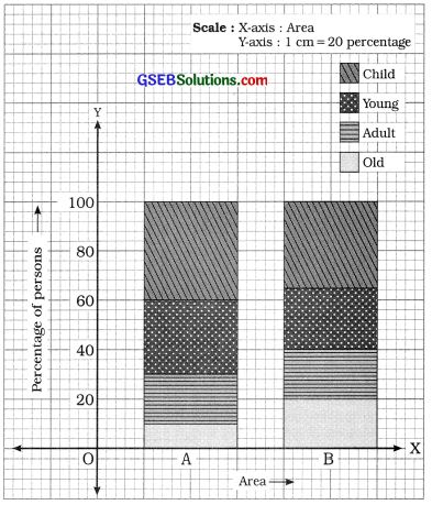
Question 6.
Draw the percentage divided bar diagram for the data given in example 5.
Answer:
The table showing the percentages of different sections of age taking 100 percentage for the total number of persons in two areas is prepared as follows :
Area is shown on X-axis. Percentage is shown on Y-axis taking scale 1 cm = 20 percentage. Drawing bars for Area A and Area B with an appropriate width and length proportional to 100 percentage, the percentage divided bar diagram is prepared as follows :
Percentage divided bar diagram showing the age of persons residing in different two areas
![]()
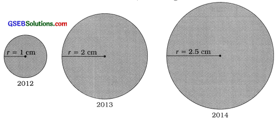
Question 7.
A car production company has during produced the following number of cars during three years. Represent it through a circle diagram.
| Year | 2012 | 2013 | 2014 |
| Production of cars | 25,600 | 1,02,400 | 1,60,000 |
Answer:
To draw circle diagram for the given data, find the square root of the production of cars and dividing it by 160, we get the radius of circle for the production of different years.
We prepare the table as follows :
| Year | Production of cars | Square root |
Radious Square root 160 |
| 2012 | 25,600 | 160 | \(\frac{160}{160}\) = 1.0 |
| 2013 | 1,02,400 | 320 | \(\frac{320}{160}\) = 2.0 |
| 2014 | 1,60,000 | 400 | \(\frac{400}{160}\) = 2.5 |
Drawing circles taking radius corresponding to production of cars in different years. Circle diagram is obtained as follows :
Question 8.
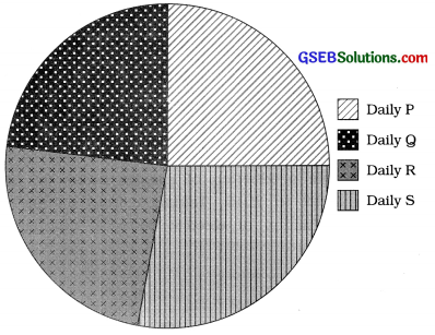
The following data represent the percentage sales of copies of daily newspapers. Represent it by pie diagram.
| Newspaper | P | Q | R | S | Total |
| Percentage of selling | 25 | 23 | 24 | 28 | 100 |
Answer:
Taking total sales 100 percentage = 3600, we find the degrees for the sales of different dallys. The table is prepared as follows:
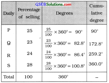
Taking an appropriate radius we draw a circle and divide it according to the degrees of the sales of different dailys, we get pie diagram as follows :
Question 9.
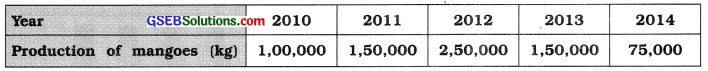
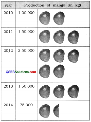
Represent the following information by a pictogram:
Answer:
Here, the production of mango (in kg) for the year 2010 to 2014 is given. Taking 1 mango picture for 50,000 kg production of mango, the pictogram for given data is prepared as in figure:
![]()
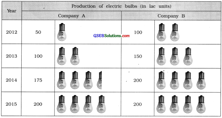
Question 10.
Details of production of electric bulb by two well-known companies are as under. Represent them by a pictogram.
| Year | Production of electric bulbs (in lac units) | |
| Company A | Company B | |
| 2012 | 50 | 100 |
| 2013 | 100 | 150 |
| 2014 | 175 | 200 |
| 2015 | 200 | 200 |
Answer:
Here, the production of electric bulbs (in lac units) of two companies A and B are given for the year 2012 to 2015. Taking 1 bulb for the production of 50 lac electric bulbs, the pictogram for the production of electric bulbs of company A and B is prepared as follows :