This GSEB Class 6 Maths Notes Chapter 9 Data Handling covers all the important topics and concepts as mentioned in the chapter.
Data Handling Class 6 GSEB Notes
Introduction:
You must have observed your teacher recording the attendance of students in your class everyday or recording marks obtained by you after every test or examination. Similarly, in your day-to-day life, you must have seen several kinds of tables consisting of numbers, figures, names etc.
These tables provide Data.
Data:
A data is a collection of numbers gathered to give some information.
Collection of Data:
The initial step of any investigation is the collection of data. It may be collection of numbers, figures, facts or symbols. There are two types of data.
- Primary Data: The data collected directly from the source is called the primary data. For Example attendance recorded by your teacher is primary data.
- Secondary Data: The data collected
![]()
Organisation of Data Through Tally Marks
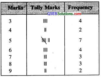
Suppose there are 25 students in a section of class VI in your school and in a test out of 10 marks they Obtained the marks as follows:
5, 7, 8, 3, 5, 9, 4, 4, 5, 7, 6, 6, 7, 8, 3, 9, 5, 6, 3, 8, 5, 5, 6, 5, 3
The data in this form is called raw data or ungrouped data. We can arrange this data in grouped form as
3, 3, 3, 3, 4, 4, 5, 5, 5, 5, 5, 5, 5, 6, 6, 6, 6, 7, 7, 7, 8, 8, 8, 9, 9
When the raw data is ordered and grouped so that it shows the number of times each value occurs, the arrangement is called frequency distribution or frequency table.
- First list of all the possible scores in a column.
- Go through the scores in the list, and for each score put a tally mark in the second column.
- Group the tallies by five marks so that they may be counted easily.
- Count the tally marks and write the numbers of each in the third column. The number of times a score occurs is called its frequency.

Representation of Data
There are many ways to represent numerical data. Such as pictographs, bar graphs etc. These graphs help us in the suitable representation of the data.
Pictograph
A pictograph is a way of representing data using pictures or symbols to match the frequencies of different information or events. The picture visually helps to understand and analyse the data.
Drawing a Pictograph
Drawing a pictograph is interesting. But sometimes, a symbol like (which was used in one of the previous examples) may represent multiple units and may be difficult to draw. Instead of it we can use simpler symbols.
Bar Graphs
Bar graph is a pictorial representation of the numerical data by a number of bars uniform width erected horizontally and vertically with equal spacing between them
Drawing Bar Graphs on Graph paper
- It should have a title at the top or a caption below the graph to indicate what it is about.
- Scale should be mentioned below the graph.
- The uniform width of the bars and the uniform gap between them is suitably choosen keeping in view the given information and the space available for the diagram.
- The suitable scale to determine the heights of the bar is also chosen keeping in view the space available for the diagram.
- Each bar should be labelled.
We may come across bar graphs in which corresponding to one value, there may be two bars. Many conclusions can be drawn from a given bar graph by just having a glance of it.