Gujarat Board GSEB Class 12 Commerce Economics Important Questions Chapter 1 Introduction to Partnership Important Questions and Answers.
GSEB Class 12 Economics Important Questions Chapter 1 Introduction to Partnership
Short Question and Answers:
Question 1.
How economics is useful in todays?
Answer:
Economics provide an explanation and world? analysis of various economic events occurring in the real world.
Question 2.
Which are the two types of pictures that depict economic information?
Answer:
Diagrams and graphs
Question 3.
Which type of frequency distribution is presented for data using diagram?
Answer:
Discrete frequency distribution of data is presented by a diagram.
Question 4.
How is continuous frequency distribution of data presented for easy is understanding?
Answer:
Continuous frequency distribution of data presented using graphs for ea understanding.
Question 5.
List down two importance of diagrams and graphs in economics.
Answer:
- Trends of certain economic parameters over various years can be observed through a single diagram or graphs.
- Changes occurring in vanous sectors of the economy can also be easily understood with the help of diagrams and graphs.
![]()
Question 6.
Which graphs are used to show trends of macroeconomic parameters?
Answer:
Time-series graphs.
Question 7.
What are the aspects to be considered while drawing a diagram and graphs?
Answer:
- Choice of type of diagram or graphs and their presentation,
- Clarity,
- Scales and measures,
- representation of axes,
- data table and source of data and
- Method of calculating the data.
Question 8.
Why does a data table and source of data accompany a diagram or graph?
Answer:
A data table and source of data should accompany a diagram/graph to increase the reliability and authenticity of the graph diagram.
Question 9.
List the types of diagrams used in economic study.
Answer:
- Pictograph,
- Scatter diagram,
- Line diagram,
- Circle diagram,
- Bar diagram, and
- Pie diagram]
Question 10.
What is time-based line diagram?
Answer:
Time based line diagram is a diagram in which pictures show the shape or slope of a relationship in economics between two variables. For example, demand curve, supply curve, etc.
Question 11.
Give some examples ¡n which time based line diagram can be used.
Answer:
Time based line diagram can be used to show size of population in different time periods, rate of inflation in various years, literacy rate in various years, etc.
![]()
Question 12.
Which are the three types of bar diagram?
Answer:
- Simple bar diagram,
- Clustered diagram, and
- Divided bar diagram]
Question 13.
Give the meaning simple bar diagram.
Answer:
A simple bar diagram represents values of only one variable over a base, say various regions or years etc.
Question 14.
What is clustered bar diagram?
Answer:
The diagram in which the values of a common variable and over a common base are given for rtore than one section of related parameters is known as clustered bar diagram.
Question 15.
Give an example of clustered bar diagram.
Answer:
Suppose if the base is time period, the variable is literacy level and its values are expressed for two sections namely, females and males then for one time period, two bars showing literacy level for females and males respectively can be drawn in clustered bar diagram.
![]()
Question 16.
What should be done in a bar diagram to create proper visual effect and help comparison?
Answer:
To create proper visual effect and help comparison, each bar is coloured differently and value which it represents are Indicated on it.
Question 17.
List down two aspects to be considered while drawing a bar diagram.
Answer:
- The width of the respective bars does not represent any data and hence all bars should be of equal width and
- The length of the respective bars should be proportional to the value of the variable which they represent.
Question 18.
In which order should the vertical barsof the data series be placed in bar diagram?
Answer:
Left to right order
Question 19.
Give the formula for obtaining proportional degree for a section on various items in a pie chart.
Answer:
[Degree = \(\frac{\text { Component value }}{\text { Total value }}\) × 360
Question 20.
List down aspeçts to be considered while drawing a pie diagram.
Answer:
- Ensure that the degrees of the total sections do not exceed 360 degree and
- Degrees for sub-divisions a’e calculated in proportion to the value of the variable for that division and the sum total or me degrees of all such sub-divisions most be 360 degree.
![]()
Question 21.
Which are the different types of graphs?
Answer:
Time-series graphs, histogram, frequency polygon, frequency curve, cumulative frequency polygon, and cumulative frequency polygon.
Question 22.
What are time-series graphs?
Answer:
Time series graphs are those graphs which show the trends in changes of trade cycle or changes in cycle of economic activities with the help of statistical tools. In these graphs changes are taken as variable and time period as base.
Question 23.
What are the uses of digital technology?
Answer:
Digital technology is used for being connected with friends and relatives, for education, to watch movies, to listen to music, to navigate our way while driving, to order purchase goods, to pay our bills, to buy tickets, etc.
Question 24.
Give examples of digital technology.
Answer:
- Computer technology,
- Internet technology
- Data CDs, etc.
![]()
Question 25.
What are the uses of Excel worksheets?
Answer:
Excel worksheets are used for entering data (figures/observations), processing data by several mathematical and statistical formula and analyzing it. For example, Excel can give us sum, average, correlation, various types of graphs and charts, etc.
Question 26.
List some statistical programmes used for data processing.
Answer:
[Excel, SPSS, SHAZAM, E-views, SAS, Gretel, PSPP, etc.]
Question 27.
How can we access or preserve important material using computer technology?
Answer:
By transferring all the material in e-mail, drop-box, Google drive, d191-locker, etc.
Question 28.
What are the cautions to be considered while using computer technology?
Answer:
The biggest limitation of computer technology is that if we do not use the right commands ¡n a computer, we may end up losing our material. Also, we might get incorrect graphs and data processing if correct formula or command is not entered.
Question 29.
What are the different uses of internet technology?
Answer:
- Educational websites acting as tutorials,
- Active learning,
- Reading material,
- Internet helps to search required information,
- It helps to get secondary data, etc.
Question 30.
Explain active learning through internet.
Answer:
Active learning is said to take place when some institutions or experts create live video lectures for students which the students can access through internet in order to gain learning and knowledge.
![]()
Question 31.
Name some of the organizations and agencies who pubhsh important data on their websites used for research.
Answer:
CSO, NSSO, WHO, UNO, CMIE, ILO, IMF, world bank, etc.
Question 32.
What do you mean by authentic data?
Answer:
Authentic data means data which is published by recognized research institutes after doing comprehensive research.
Question 33.
Give some example of data CDs.
Answer:
CD of national income accounts of India, CD of census of India, CD of annual survey of industries in India, CD of NSSO, CD of data pertaining to any ministry in India, etc.
Long Answer Type Questions:
Question 1.
Explain briefly the need of diagrams and graphs in the study of economics.
Answer:
- Economics provides an explanation and analysis of various economic events occurring in the real world.
- For studying these events a lot of data is collected, ft is then analysed and represented in simpler forms.
- Pictorial representation is a very effective and easy way to represent data analysis.
- Diagrams and graphs are two ways of representing the information pictorially so that general public can understand it easily.
- Data understanding and analysis is out of reach and interest of general public. When such information is provided in an easy manner through diagrams and graphs people tend to take interest in them.
- A layman may call diagram and graph as one but Statistics classifies diagrams and graphs as different types of pictures. Both of these are used for distinct purpose. Similarly, even in economics these two are used to fulfill different purposes.
Question 2.
Define diagram and explain it.
Answer:
Diagram:
- A pictorial representation of observed data is called a diagram.
- Although one needs to make use of scale and measurement to draw a diagram, one does not need to have a thorough knowledge of statistics to draw it.
- A diagram is drawn for data having discrete(discontinuous) frequency distribution. For example, the data could be
- No. of children born in a month,
- Price in rupees,
- No. of road accidents, etc.
- Diagram is self-explanatory in nature and can be easily created and understood by anyone.
- A diagram is used by advertising companies to attract customers, by government and other organizations to provide information, etc.
Example of discrete, (discontinuous) data:
| Price (In Rs.) | Demand (in units Frequency) |
| 1 | 100 |
| 2 | 80 |
| 5 | 70 |
| 7 | 20 |
| 10 | 10 |
Types of diagrams:
Most common types of diagrams used in economic study are –
- Pictograph
- Scatter diagram
- Line diagram (based on time periods)
- Circle diagram
- Bar diagram
- Pie diagram
![]()
Question 3.
What is a graph? Explain.
Answer:
Graph:
- A pictorial representation of observed data is called a graph.
- A graph is drawn for statistical information which is not self-explanatory. In other words, the graph can neither be created nor be understood by people who do not have thorough knowledge of statistics.
- A graph is drawn for data having continuous frequency distribution. For example,
- Classification of people into various groups based on their incomes
- Division of students on the basis of their marks, etc.
Example of continuous data:
| Income of people per month (in Rs.) | Number of people earning the income (Frequency) |
| 10,000 – 20,000 | 500 |
| 20,000 – 30,000 | 300 |
| 50,000 – 1,00,000 | 100 |
Generally, continuous data is bigger in size and complex in nature. Hence, statistical tools are used to analyze, classify and simplify it.
- A graph is generally drawn on a graph paper. A graph can extend over one or more of the four quadrants obtained by the intersection of ‘X’ and ‘Y’ axis on a plane. Moreover, it cannot be drawn without taking appropriate measurements.
- Graphs are used more by researchers and in higher education.
- Graphs are not used or published for general public. They are created by researchers for their data analysis and understanding purposes only.
Types of graphs:
Important graphs used in economic study are:
- Time-series graphs
- Graphs for continuous frequency distribution
- Histogram
- Frequency polygon
- Frequency curve
- Cumulative frequency polygon
- Graphs for logarithmic data
![]()
Question 4.
State the most common types of diagrams.
Answer:
Most common types of diagrams used in economic study are:
- Pictograph
- Scatter diagram
- Line diagram (based on time periods)
- Circle diagram
- Bar diagram
- Pie diagram
Question 5.
How does statistics classifies graphs? List them. OR Enlist the various types of graphs used in economic study. (2 marks)
Answer:
Types of graphs:
Statistics classifies the various types of graphs as follows:
- Time-series graphs
- Graphs for continuous frequency distribution
- Histogram .
- Frequency polygon
- Frequency curve
- Cumulative frequency polygon
- Logarithmic graphs
Question 6.
For which difficult to understand economic principles diagrams and graphs are a boon? (2 marks)
Answer:
Diagrams and graphs help to understand various difficult principles of economics easily.
Example:
- The concepts of expansion and contraction of demand and supply, price elasticity of demand and supply, etc. can be easily understood by pictures.
- Trends of macroeconomic parameters can be clarified through time-series graphs.
- For example, the short-run and long-run irregular fluctuations in agriculture or the regular fluctuations in some industry are calculated by the method of time series and their trends are presented by way of time-series graphs.
Question 7.
Explain time-based line (curve) diagram along with data and brief analysis. (5 marks)
Answer:
Time-based line (curve) diagram:
- This diagram is used when we have ‘time related data’. For example, price of a given share in last 30 days, number of vehicles passing through a cross road every hour of a day, growth of population from 1951 to 2001, etc.
- The line-diagram represents the relation between the two economic variables and the slope.
- Line-diagram can be used for showing the demand curve, supply curve, etc.
- The independent variable (usually, time) is measured on ‘X’ axis and the dependent variable is measured on ‘Y’ axis.
Use in economics:
In economics, a time-based line diagram is used to show the size of population in different time periods, rate of inflation in various years, literacy rate in various years, etc.
Example:
Percentage growth rate of India’s population since 1951
| Decade | Decadal Growth Rate of Population in % |
| 1951-61 | 21.64 |
| 1961-71 | 24.80 |
| 1971-81 | 24.66 |
| 1981-91 | 23.87 |
| 1991-2001 | 21.54 |
| 2001-2011 | 17.64 |
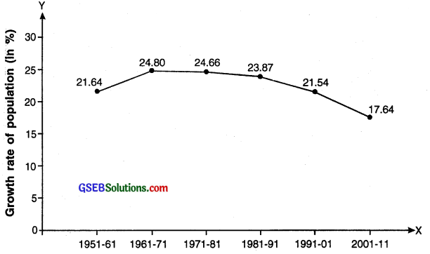
Analysis:
The time-based line diagram tells us that if we look from percentage perspective the.. India’s population growth-rate has shown downward trend except in year 1961-71.
![]()
Question 8.
What is a bar diagram? How many types of bar diagram are there?
Answer:
Bar diagram:
A bar diagram is a chart that uses bars to show comparison between categories of data. The bars can be either horizontal or vertical.
Purpose:
- A bar diagram shows distribution of the value of a variable in various sections. For example, literacy rate in a country in various years or literacy rate among females and males in a particular year.
- A vertical or horizontal bar is drawn for each value of the variable.
- A separate bar is drawn for each section and the height/length of the bar indicates the value for that section.
- Thus, by comparing the height/length of the bars a comparison can be made of the values of each section.
Types:
Bar diagrams are generally of three types:
(A) Simple bar diagram
(B) Clustered bar diagram
(C) Divided bar diagram.
Question 9.
Explain simple bar diagram along with data and brief analysis. (5 marks)
Answer:
Simple bar diagram:
- A simple bar diagram is a bar diagram which represents values of only one variable over a base.
- Through simple bar diagram, one can represent data of sale in various regions, months or years, etc.
- The difference in the length of bars gives a visual effect of the difference in the value of the variable under study.
Example:
Bi-monthly sale of chocolate boxes in a shop
| Months | Sale in units |
| Jan-Feb | 35 |
| Mar-Apr | 60 |
| May-June | 65 |
| July-Aug | 40 |
| Sep-Oct | 50 |
| Nov-Dec | 30 |
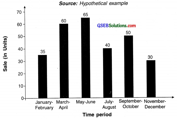
Simple Bar Diagram
Analysis:
Looking at the bar diagram we can say that the sale of mobile phones was highest in the months of March and April and May and June. It was lowest in the month of November-December.
![]()
Question 10.
Explain clustered bar diagram along with data and brief analysis. (5 marks)
Answer
Clustered bar diagram:
In this type of a diagram, values of a common variable and over a common base are displayed for more than one section of related parameters. Hence we get a cluster of bars for the same variable over various values/sections at the base.
Use in economics:
- Suppose a mobile store owner has two branches. If he wish to compare sales of each branch for a given period of time then he can use clustered bar diagram.
- Another example could be variable ‘year’ as the base and comparing literacy of two sections namely males and females. This will be a two clustered bar diagram and each pair of bar will show literacy rate of male as well as female.
- To separate the bars properly, the clustered bars are given either different colours or designs. Each value point is then represented on the bar.
Example:
The example below shows the bi-monthly sale of chocolate boxes of different sizes in a shop.
Number of chocolates sold
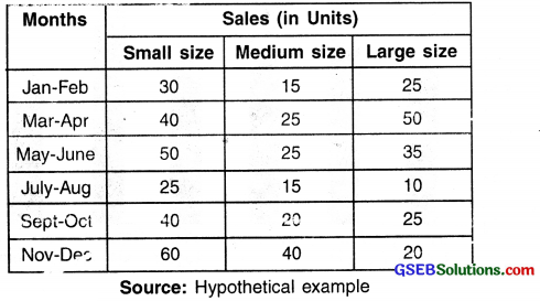
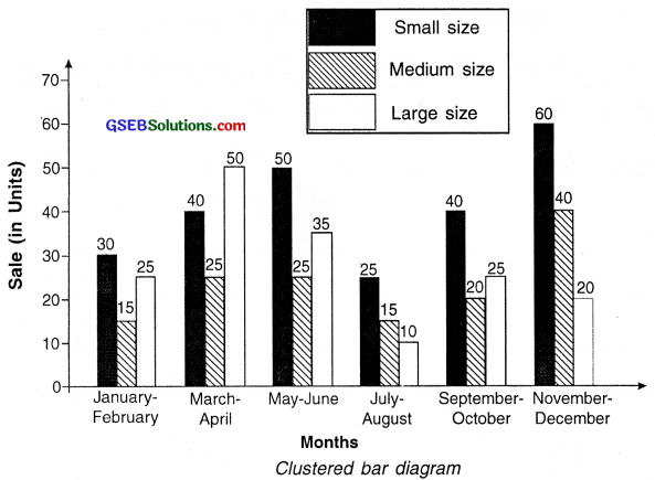
Analysis:
- The diagram shows cluster of sale of three different sizes of chocolates for various months.
- Looking at the November-December period we can see that the sale was highest for small size chocolate boxes followed by medium and large. Whereas the data of March-April tells that large boxes made the highest sale.
![]()
Question 11.
Explain divided bar diagram along with data and brief analysis.
Answer:
Divided bar diagram:
- Divided bar diagram is a bar diagram wherein each bar is divided into several segments to represent a set of quantities according to the different proportions of the total amount.
- In this diagram every single value of the variable has sub divisions. Hence we get divisions in all the bars which represent a common variable and common base values.
- Each division of the bar is colored differently to distinguish between the divisions. Values are put on each division so that it is easily understood.
Example:
The example below shows bi-monthly sale of chocolate boxes by a sales person in rural and urban areas in a region.
Sale of chocolates ¡n rural and urban areas

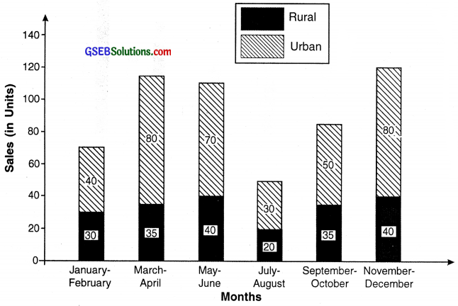
Divided bar Diagram
Analysis:
The sale in urban area is highest in the months of March-April and November-December. In case of rural sales, it is highest in May-June and November-December.
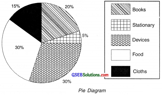
Question 12.
Explain pie diagram along with data and brief analysis. (5 marks)
Answer:
Pie-diagram:
- A pie diagram (or a circle chart) is a circular statistical diagram which is divided into slices to illustrate numerical proportion.
- Division of a circle in degrees represents a pie diagram.
- If an entire circle is considered as universal set of an entire data and the different sections of this data are represented by dividing the circle in degrees proportional to the data then a pie diagram is obtained.
- Note that we can draw pie diagram for the similar type of data for which a bar diagrams can be drawn.
- The complete circle represents 360°. Hence, the entire data represents 360° and sections/divisions of the data are represented by dividing the circle in degrees proportional to each data section.
Formula for obtaining proportional degree for a section of data:
Degree = \(\frac{\text { Component value }}{\text { Total value }}\) × 360
Example:
The data below shows the percentage of pocket money spent by a student on various items.
Percentage of pocket money spent by a student on various items
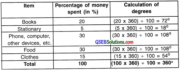
Source: Hypothetical example
![]()
Question 13.
State the points to be considered while drawing a pie diagram.
Answer:
Aspects to be considered while drawing a pie diagram:
- Ensure that the degrees of the total sections do not exceed 360°.
- Degrees for sub divisions are calculated in proportion to the value of the variable for that division. So, the sum total of the degrees of all such sub divisions must be 360°.
- If relevant data is to be compared across regions or time periods then two pie graphs can be drawn side by side. For a data set with a smaller total value, a circle with smaller dimensions is drawn and for a data set with larger total value, a circle with bigger dimensions is drawn.
Question 14.
What is a time series graph? Explain.
Answer:
Time series graph:
- The illustration of data points at successive time intervals is known as time series graph.
- For example, in a trade cycle or in cycles of economic activities, short term and long term regular or irregular (erratic) changes are observed. The trends of such changes are obtained with the help of statistical tools.
- Graphs drawn by taking these changes as variables and plotting the values of these variables over time as data points are called time series graphs.
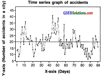
Time series graph of accidents taking place in a city (For information only)
![]()
Question 15.
State the role of Excel sheets in economics.
Answer:
Excel worksheets:
- Economics deals with lots of data. Researchers come across data having thousands of observations on a daily basis. It is almost impossible to handle so much data manually.
- Microsoft Excel is a powerful tool for handling large data related to several economic parameters and then and performing analysis on it.
- For example, if we survey on number of items produced by small scale industries in India, we would get thousands of observations.
- We can feed this data in excel and get various figures such as total production, average production, number of units in a given region, total exports, etc. within seconds.
- Excel also has numerous types of graphs and diagrams which can be created within a click.
Question 16.
What are storage tools? How do they help in preserving data? Also, state the various means to store data.
Answer:
Other tools:
- Microsoft Excel cannot handle very large amount of data. For this purpose there are various statistical software available which are highly advanced, sophisticated and can handle any size of data.
- SPSS, SHAZAM, E-views, SAS, etc. are few of the such statistical software.
- This software can process data for lakhs of observations that too within seconds or minutes.
- Since these statistical software are very costly, they are mostly bought by research institutes or government organizations.
- There are also certain statistical software like Gretl, PSPP, R, etc. which are available free of cost on the internet but does almost same tasks of analysis as done by the costly software.
- Now-a-days many of these functions of a computer are also available on smart phones and tablets.
Question 17.
State the drawback of Excel and means to overcome it. (2 marks)
Answer:
Other tools:
- Microsoft Excel cannot handle very large amount of data. For this purpose there are various statistical software available which are highly advanced, sophisticated and can handle any size of data.
- SPSS, SHAZAM, E-views, SAS, etc. are few of the such statistical software.
- These software can process data for lakhs of observations that too within seconds or minutes. Since these statistical software are very costly, they are mostly bought by research institutes or government organizations.
- There are also certain statistical software like Gretl, PSPP, R, etc. which are available free of cost on the internet but does almost same tasks of analysis as done by the costly software.
- Now-a-days many of these functions of a computer are also available on smart phones and tablets.
![]()
Question 18.
What care should one take care while using computer technology in economics?
Answer:
- One should never forget that although computer helps in studying, it is not a study material by itself. Computer helps to make the process of studying easier and faster but it does not replace the process of studying.
- One should be able to make wise use of them during their study. One should have good knowledge of computers as well as the statistical tools that we make use in them.
- Computers do not have brain of their own. We may select any data and on one click we may get the diagram and graph we aim for but, it is our duty to see that we select the correct data, give suitable commands and obtain the desired analysis and pictorial representation.
- We may also end up getting incorrect graphs and data processing if we do not know the correct formulae and commands.
- If we do not use the right commands in a computer, we may even end up losing our material.
Question 19.
What kind of secondary data is available on internet? (2 marks)
Answer:
Data: Economics uses a lot of secondary data. For instance, we use data on budget of a government, on banking, on agricultural production, on value of exports and imports, on poverty, on employment, on industrial production, etc. These data can be accessed from authentic websites. For example, authentic site for data and banking in India is the official website of Reserve Bank of India, for exports and imports is the website of Ministry of Commerce and Industries of Government of India. Budget related information from Ministry of Finance, Government of India and so on. Some organizations and’agencies functioning at national and international levels also collect publish as well as put data on websites. For example, CSO NSSO, WHO, UNO, CMIE, ILO, IME, World Bank and so on.
Question 20.
What care should one take while using internet as a tool for education?
Answer:
One should take following care while using internet for education:
- Just like computer, internet is also only a tool. It cannot replace books and teachers or our own thinking and reasoning.
- A lot of bogus material, irrelevant information, misleading information, plagiarized articles are available on internet. We must avoid using such information and material.
- Readers must use their own wisdom to identify if the material given is authentic and reliable or not.
- One must use data or information only from those websites which are authentic and reliable.
![]()
Question 21.
What difficulty does one face while using data CD?
Answer:
The data CDs contain voluminous data that too of various types.
Only a person having thorough knowledge about economics and statistics can’ make use of this data. Which data can be used in which manner, how to mix and match various data sheets, what analysis should be done and what should be concluded from the data available in the CD can be done by experts only.
Multiple Choice Questions
Question 1.
Which of the following type of pictures are used to depict information related to economic changes?
(A) Diagrams
(B) Graphs
(C) Both (A) and (B)
(D) Clip arts
Answer:
(C) Both (A) and (B)
Question 2.
In which of the following, thorough knowledge of statistics is not required?
(A) Diagram
(B) Graphs
(C) Charts
(D) None of these
Answer:
(A) Diagram
Question 3.
Graphs are mostly used in
(A) primary education
(B) Higher education
(C) Both (A) and (B)
(D) Only used by researchers
Answer:
(B) Higher education
![]()
Question 4.
How can clarity be made while drawing a diagram or a graph?
(A) Appropriate size and scale should be taken
(B) Different colours or shades should be used
(C) Data table should be present with every diagram or graph
(D) Statistical method used should be stated
Answer:
(B) Different colours or shades should be used
Question 5.
Which of the following is not a type of diagram?
(A) Pictograph
(B) Circle diagram
(C) Scatter diagram
(D) Histogram
Answer:
(D) Histogram
Question 6.
Which of the following diagrams can be used to represent rate of inflation in various years?
(A) Bar diagram
(B) Scatter diagram
(C) Time based line diagram
(D) Pie diagram
Answer:
(C) Time based line diagram
Question 7.
Which of the following is not a type of bar diagram?
(A) Cluster bar diagram
(B) Scatter bar diagram
(C) Simple bar diagram
(D) Divided bar diagram
Answer:
(B) Scatter bar diagram
Question 8.
Which type of diagram represents values of a common variable and over a common base are given for more than one section of related parameters?
(A) Cluster bar diagram
(B) Pie diagram
(C) Divided bar diagram
(D) Circle diagram
Answer:
(A) Cluster bar diagram
![]()
Question 9.
Which of the following should be proportional to the value of the variable which they represent in a bar diagram?
(A) Width of the bars
(B) Distance between all the bars
(C) Order of the bars
(D) Length of the bars
Answer:
(D) Length of the bars
Question 10.
In a pie diagram, the entire data represents
(A) 90 degree
(B) 180 degree
(C) 360 degree
(D) 270 degree
Answer:
(C) 360 degree
Question 11.
Which of the following is not a type of graph?
(A) Frequency polygon
(B) Histogram
(C) Pictograph
(D) Time-series
Answer:
(C) Pictograph
Question 12.
Which of the following graphs show changes in trade cycles and its trends with the help of statistical tools?
(A) Time series graphs
(B) Histogram
(C) Graphs with logarithmic data
(D) Frequency polygon
Answer:
(A) Time series graphs
Question 13.
Which of the following is a digital tool?
(A) SAS
(B) R
(C) Data CDs
(D) All of these
Answer:
(D) All of these
![]()
Question 14.
Which of the following computer technologies helps us to find out the correlation between variables?
(A) Presentations
(B) Storage tools
(C) Diagrams and graphs
(D) Excel worksheets
Answer:
(D) Excel worksheets
Question 15.
What can we use to access our stored information in a computer from any part of the world?
(A) By using notebooks
(B) By using hard disc
(C) By using digi-locker or Google drive
(D) By using pen drive
Answer:
(C) By using digi-locker or Google drive
Question 16
Which of the following is a statistical programme used for data processing?
(A) SPSS
(B) C++
(C) Excel
(D) Both (A) and (C)
Answer:
(D) Both (A) and (C)
Question 17.
Which of the following software is pretty expensive?
(A) Gretel
(B) PSPP
(C) SAS
(D) R
Answer:
(C) SAS
Question 18.
Name the term which means enrolling to sites and listening to lectures on net by experts.
(A) Tutorials
(B) Active learning
(C) Reading material
(D) Data screening
Answer:
(B) Active learning
Question 19.
Which agency creates data software which can be purchased only by researchers and corporations?
(A) NSSO
(B) CMIE
(C) NIA
(D) Survey Organization of India
Answer:
(B) CMIE
![]()
Question 20.
Which of the following CDs is used by educational institutions?
(A) CD of census of India
(B) CD of Annual survey of industries in India
(C) CD of national income accounts of India
(D) All of these
Answer:
(D) All of these